Many elements go into good design. Because we're a design studio, we look at a lot of elements that we eventually combine together to make the final product, whether it's a website, print collateral, package design or a new brand image. One element that tends to particularly stand out is typeface. Using typeface to establish market presence is not a new vision. This single element alone represents the face of a company and can offer a reassuring familiarity that consumers grasp. Let's take an introspective look at this essential element of design.
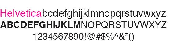
Gap, American Airlines, 3M, Microsoft, Lufthansa, and Staples all have one thing in common (besides being large contributors to the capitalistic endemic). These big companies all use the same branding element in their logos: the infamous typeface, Helvetica. For the past 50 years, Helvetica has been the element that helps create a strong, lasting brand identity for many companies through this typographical element.
This year marks the 50th anniversary of Helvetica. This Swiss sans serif has made an overwhelming impact in the design world. While there are many blogs dedicated to voicing their disgust of Helvetica as the "corporate chic" of typefaces and some BBC News members deem it as a "vehicle for social conformity through consumerism," there are many other design-oriented people who think the exact opposite. Gary Hustwit went so far as to create a documentary film aptly titled, Helvetica. To many people's dismay, Helvetica, which is currently screening all over the world, has become the number one independent film in the United States in 2007. But why would someone go so far as to make an entire film on the ways in which letters and characters are stylized? Hustwit wittily maintains that there is a greater significance to the whole meaning behind Helvetica.
"Since millions of people see and use Helvetica every day, I guess I just wondered, "Why?" How did a typeface drawn by a little-known Swiss designer in 1957 become one of the most popular ways for us to communicate our words fifty years later? And what are the repercussions of that popularity, has it resulted in the globalization of our visual culture? Does a storefront today look the same in Minneapolis, Melbourne and Munich? How do we interact with type on a daily basis? And what about the effects of technology on type and graphic design, and the ways we consume it? Most of us use computers and digital fonts every day, so are we all graphic designers now, in a sense?"
Typeface is one of the most important elements to good design and if it's part of a logo then it is inarguably the face of the company. Karyn Roszak, overseer of 3M's corporate identity understands that having a brand image that correlates across multiple mediums is a very important part of the way a company is perceived. "Helvetica's sense of familiarity translates well across the company's divisions - from adhesives to nanotech - and therefore aids internal communications."
"Typefaces control the message. Choice of font dictates what you think about something before you even read the first word." This almost sounds like subliminal messaging. Perhaps mere letters in their existential form have become the decision makers of our subconscious thought. Typeface is just another element of design, but has it become the determining factor of what establishes the entire ethos of a brand? What would the IBM logo be today if it were a lower case, italic typeface?