Responsive Design for Brands
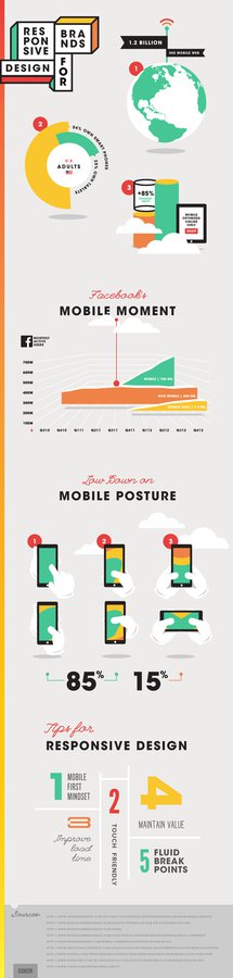
With over 1.2. billion mobile web users worldwide, it’s clear that mobile is shaping when, where and how consumers shop, research and connect online. Studies have shown that 54% of adults in the U.S. own smartphones and 25% own tablets. Online only storefronts with mobile optimization have seen engagement increase by up to 85% compared to sites without mobile optimization. In 2012, Facebook found that their active mobile users surpassed their non-mobile users, now referred to as “The Mobile Moment.” These staggering statistics reinforce just how important a mobile presence is for any brand.
As mobile commerce numbers continue to climb, responsive web design has also emerged as one of the hottest digital topics in 2013. Through a singular code base, responsive design offers brands unprecedented ease of site management and brand continuity across all devices. Replacing all device-specific sites with one responsive site also helps build and maintain SEO value, making responsive websites Google’s top recommendation for mobile search optimization.
Now is the time to prioritize responsive design and capture sales from the mobile users already visiting your site. We’ve provided five tips to help you navigate your way to a seamless responsive website:
1. Mobile First Mindset: Design for a mobile screen should be the starting point of all responsive website design. This forces designers to simplify all web content, only including what is necessary. Design for the smallest screens, such as mobile phones, should be completed before enhancing the layout for larger computer screens.
2. Touch Friendly: 61% of users said that if they didn’t find what they were looking for right away on a mobile site, they would quickly move on. Studies have shown that 49% of users only use one thumb to navigate a touch screen, making the top left section of the screen inaccessible. 36% were shown to use two hands, one hand cradling the device and the other hand “poking” at the screen. Keep these user patterns in mind when designing your mobile layout, creating a touch experience that is accessible for your users.
3. Improve Load Times: Unfortunately, not every consumer has access to WiFi or a 4G connection on their mobile device. Studies show that even a one second delay in load time can result in a 7% decrease in online sales.
4. Maintain Value: Just because your responsive website will visually appear different on each screen size does not mean you should sacrifice any of your website’s features. Treat both your web and mobile customers to a full-featured website with rich, engaging content.
5. Fluid Breakpoints: With the growing number of new phones, tablets, and e-readers available on the market, it’s impossible to plan your breakpoints around every screen size. Consider a device agnostic approach and set your breakpoints where they fall most naturally around your design.
Are you interested in updating your digital presence with a fully responsive website? We’d love to chat! Feel free to reach out here.